5 days, August 2022
UI/UX Designer
Figma, Adobe Illustrator, Adobe Photoshop

WhenToWork is a privately owned California corporation that provides an online scheduling platform to businesses across the country. For this individual project I used my personal experience with the WhenToWork app over the course of four years, along with surveyed user input to identify the primary problems within the current app and redesign a more clear, user-friendly, application.
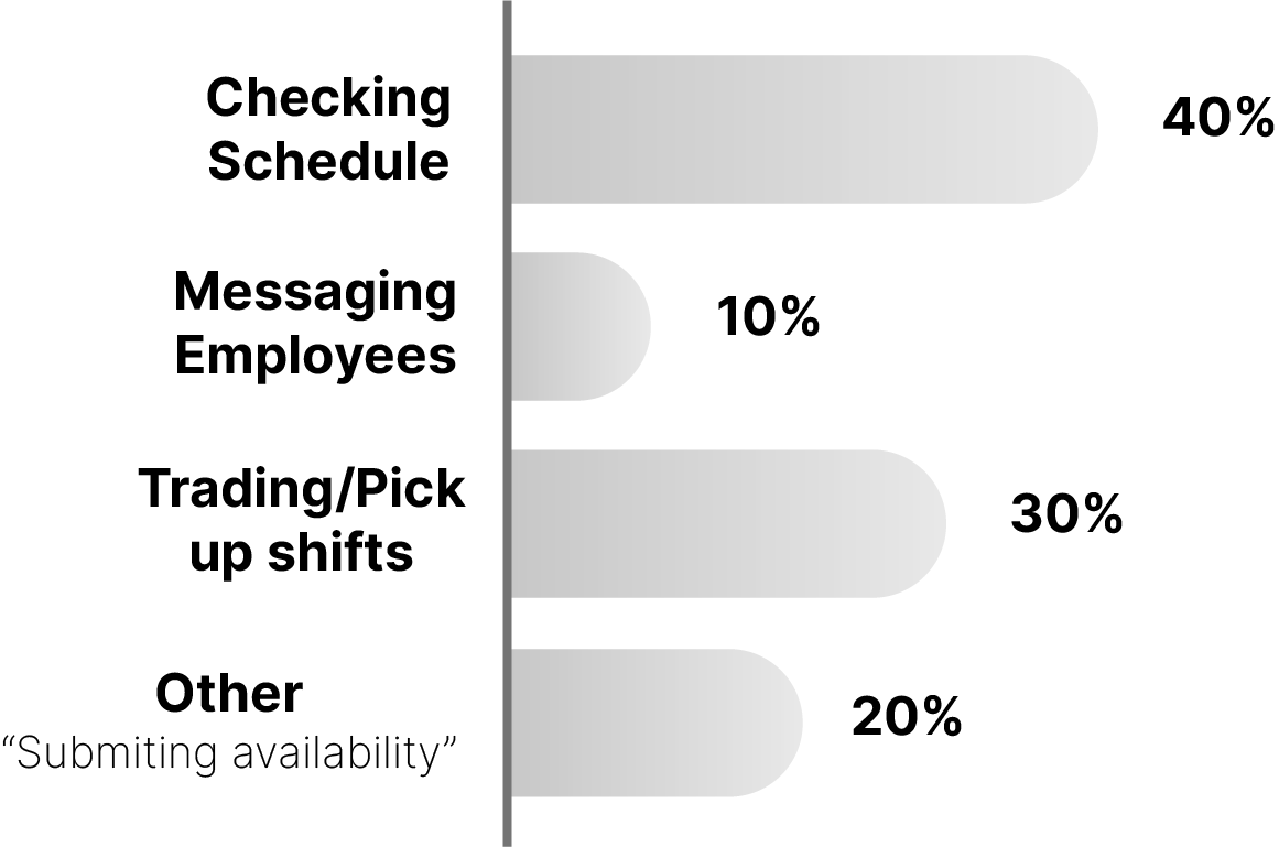
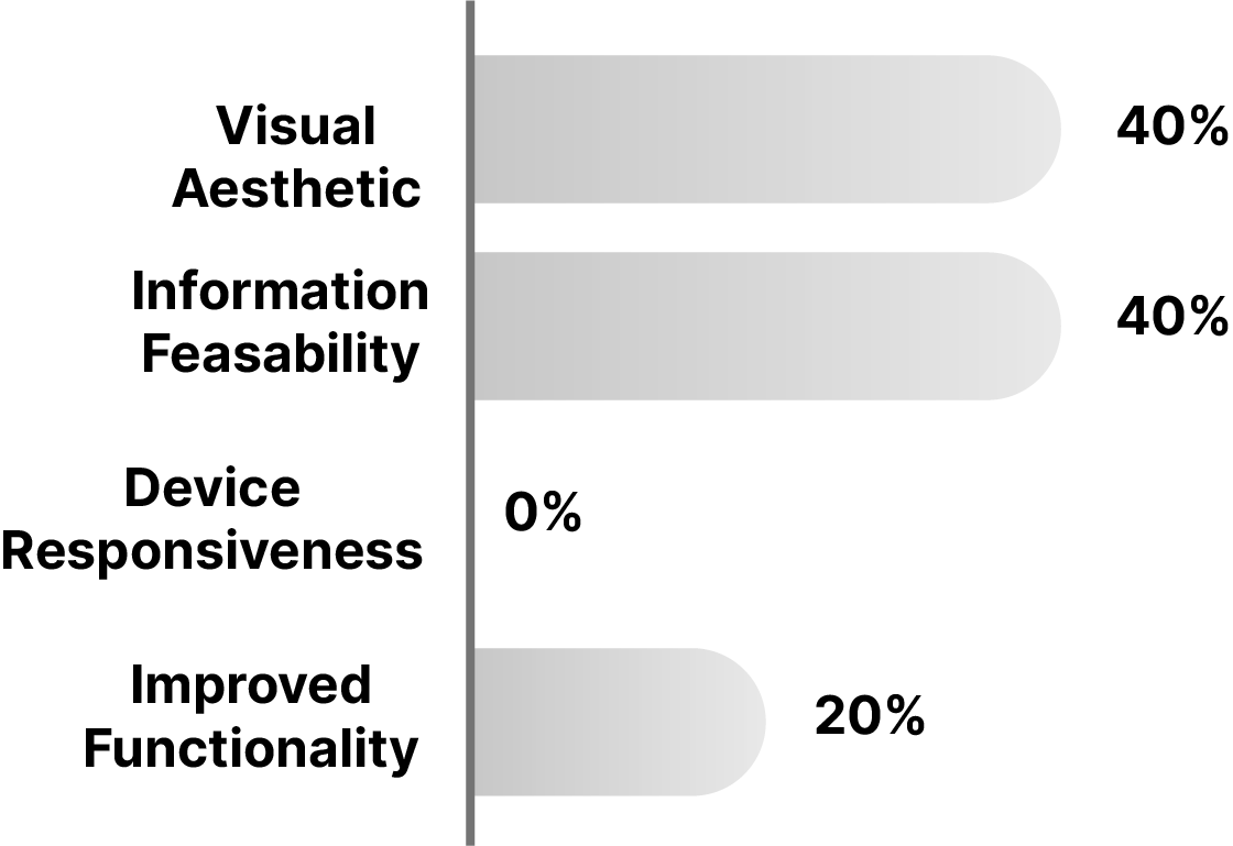
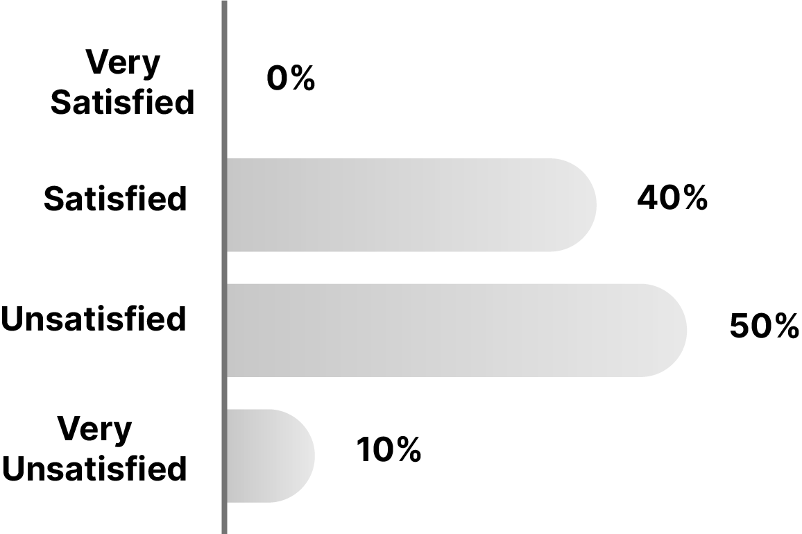
In addition to my personal experience with the WhenToWork app for over four years, I also surveyed 20 other users of the WhenToWork app. The survey included questions concerning their experiences while performing various actions on the site (checking the schedule, messaging other employees, trading shifts, etc.) and also questions about what changes they would like to see in the redesign.
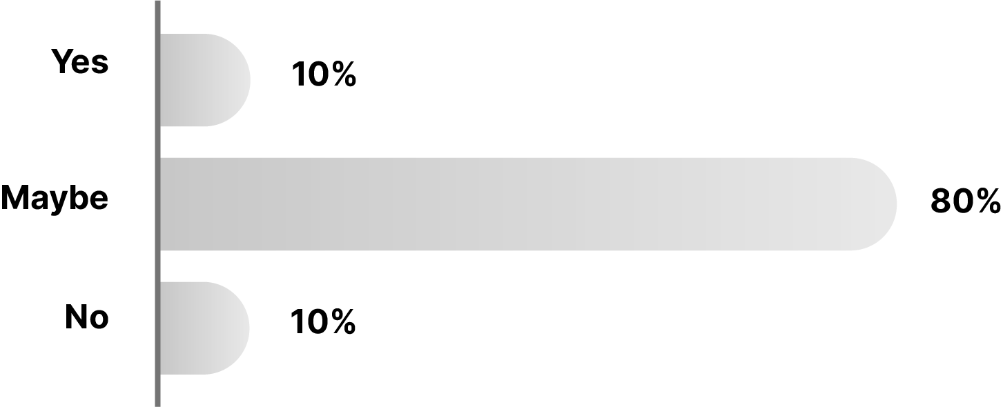
Response 1: "Didn't even know the app allowed me to message other staff!"
Response 2: "Design feels out of date compared to other apps"
Response 3: "Information is repeated across the app and is very unorganized"
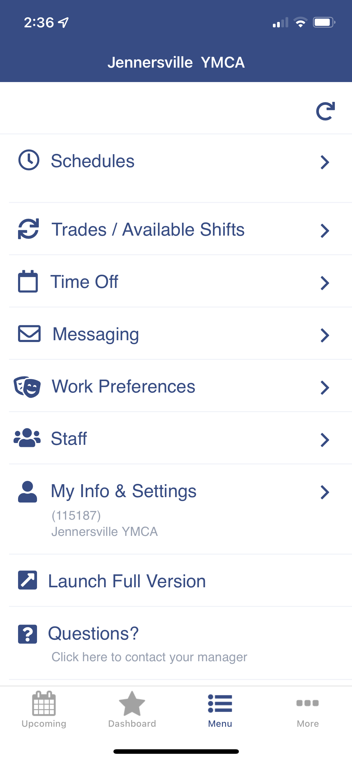
The current app is very bland and is visually outdated. Despite the development efficiency, the block-shaped buttons with the lack of hierarchy make the site dull and lacking user engagement. Creating a more modernized app design with visual hierarchy will help reinstate a “wow factor” for the app, in addition to creting a more intuitive user-flow.
The current app design contains duplicated information, just reformatted on a new page. The “upcoming” and “dashboard” pages both show the user’s upcoming shifts in a similar weekly calendar format, making the app difficult to navigate. There are also various methods of accessing the user’s schedule, all in different places on different pages, again increasing navigation difficulty. The app must not only be redesigned but the information must also be reorganized in a more user-friendly manner.
The current app allows users to send messages, but the process of doing so forces a user to navigate to the “menu” page, then select “messages”, then click “new message”, and then finally compose a message. But even when they begin to write a message, they must know the recipient’s contact information prior to composing the message. This app redesign needs to ifacilitate the method of sending messages to employees and receiving messages from other employees, without having to go through a multi-step process. This will increase the overall efficiency of the app and better reveal one of the app’s currently ‘hidden’ features.
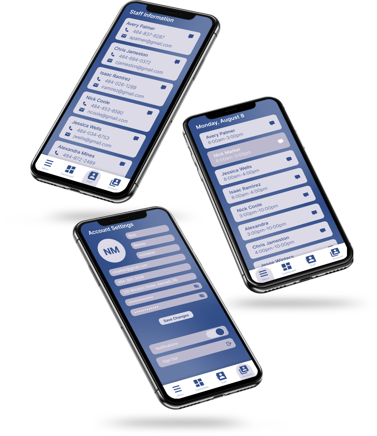
A modern design with buttons that have a clear sense of hierarchy with blue typefaces on a white button. The curved edges of the buttons create an updated look when compared to the block shaped buttons. Bottom icons are a more muted color in order to keep user attention focused on the page's content.
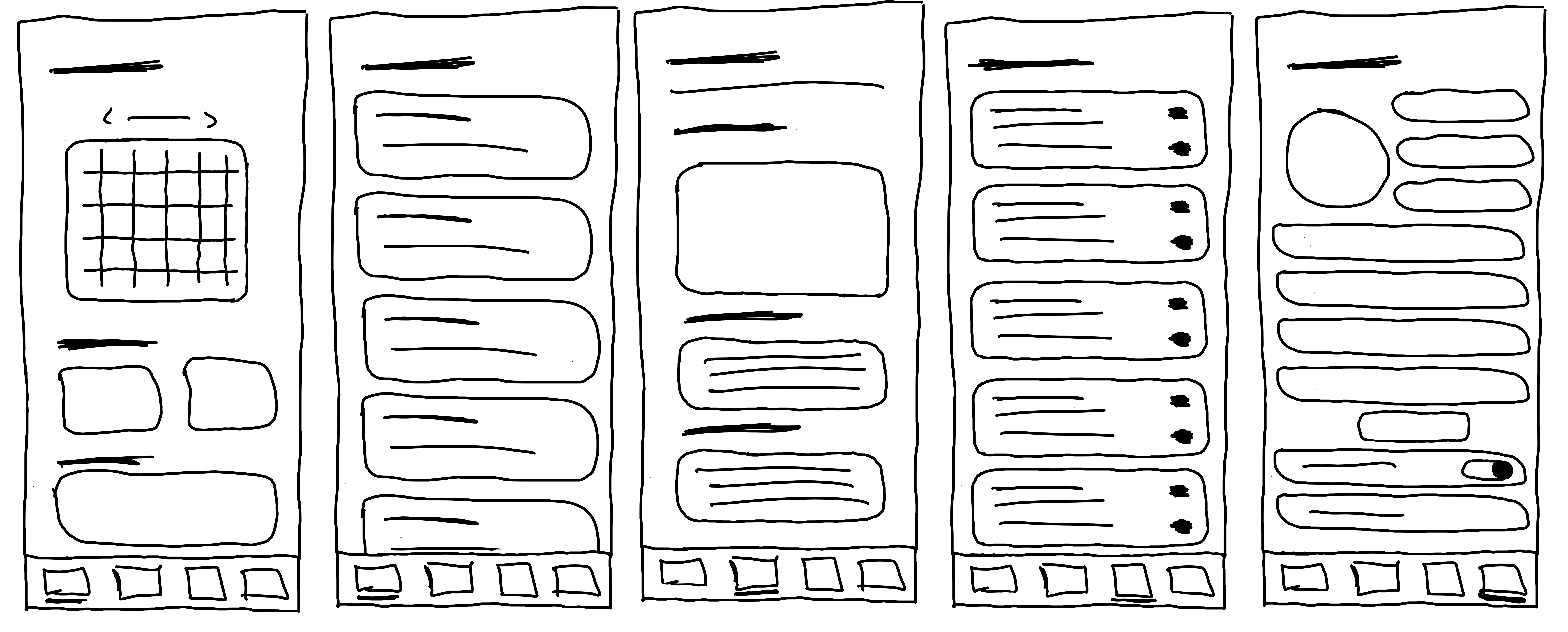
The different pages of the app all serve their own purpose and there is no duplicated information. The buttons on the “Home” page organize the basic duties of the app into their own section, making the different actions easily distinguishable by the user.
There is a specific “Messages” button on the home page where all actions related to messaging can be found. When on other pages, there is a small mail logo at the top of the app that redirects the user to the same “Messages” page. When searching for people to send a message to, their account automatically populates when you type their name. Sending a message can be done entirely on a single page, increasing the user-friendly aspects of the site.
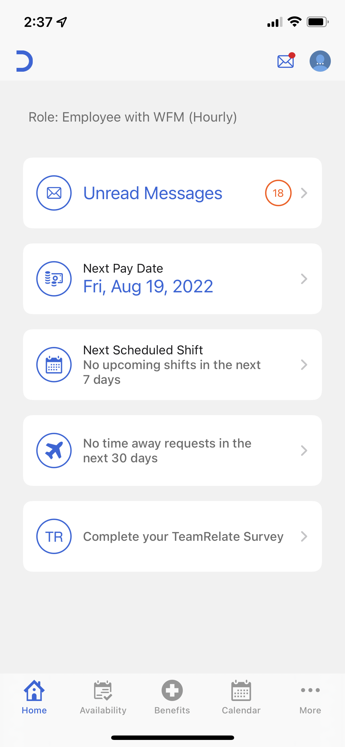
Must maintain the same color palette and logo as the current WhenToWork mobile app.
All of the information and pages presented on the current app must remain, however sections may be moved or reorganized to redefine the structure of the app.
The messaging system is only operable within the WhenToWork app. Staff phone numbers and emails are available to access, however the in-app messaging only allows the user to send/receive messages through the WhenToWork app.
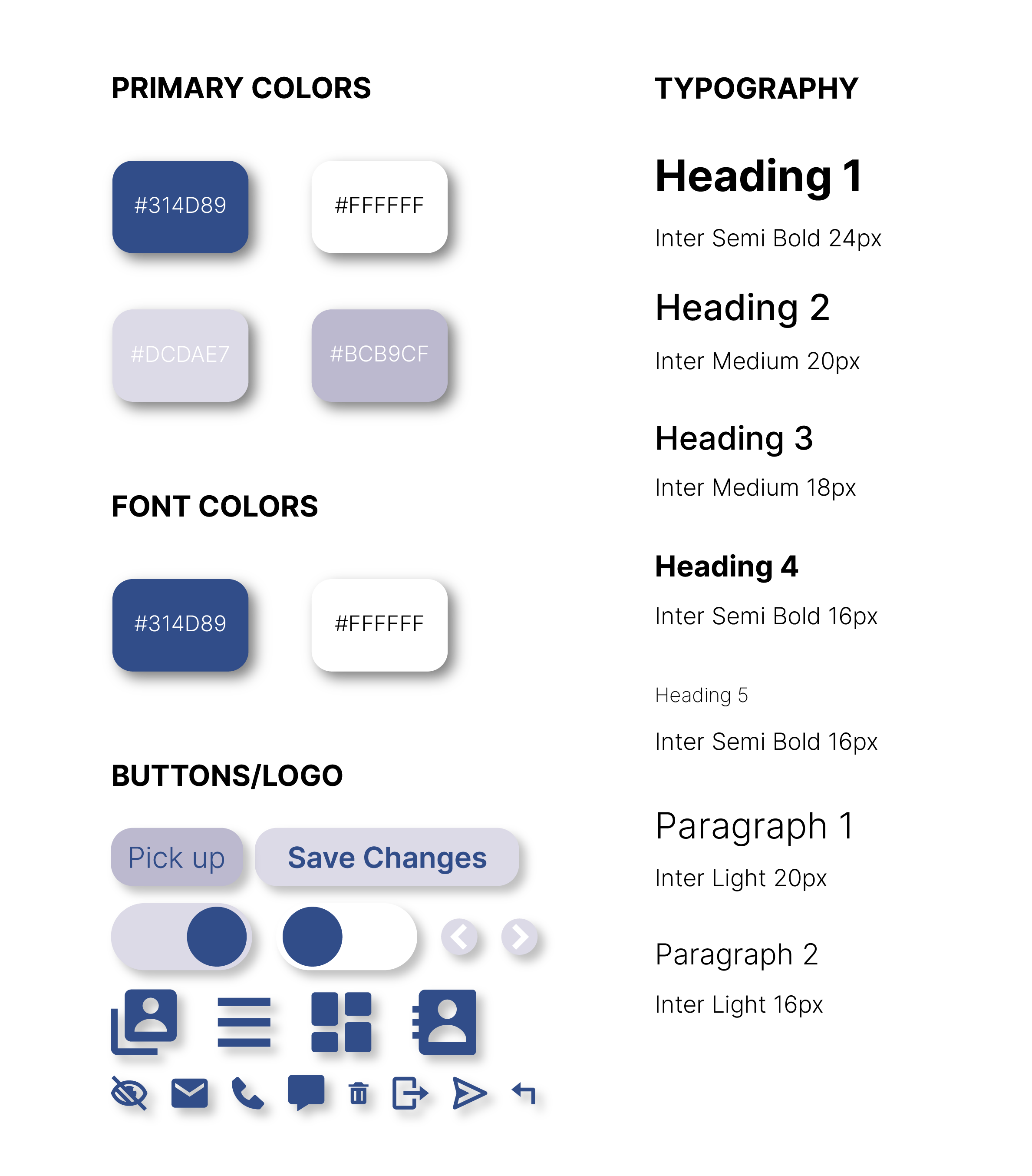
This redesign now more closely relates visually to WhenToWork's competitors through the curved button edges and updated icons. These icons are not only more relevant to the time but are also more intuitive to what actions they provide. Additionally, the new typeface provides a sleek, modern look to the app's redesign, while also providing hierarchy to the different aspects of the app. All together these changes work to facilitate the different actions made by the user.
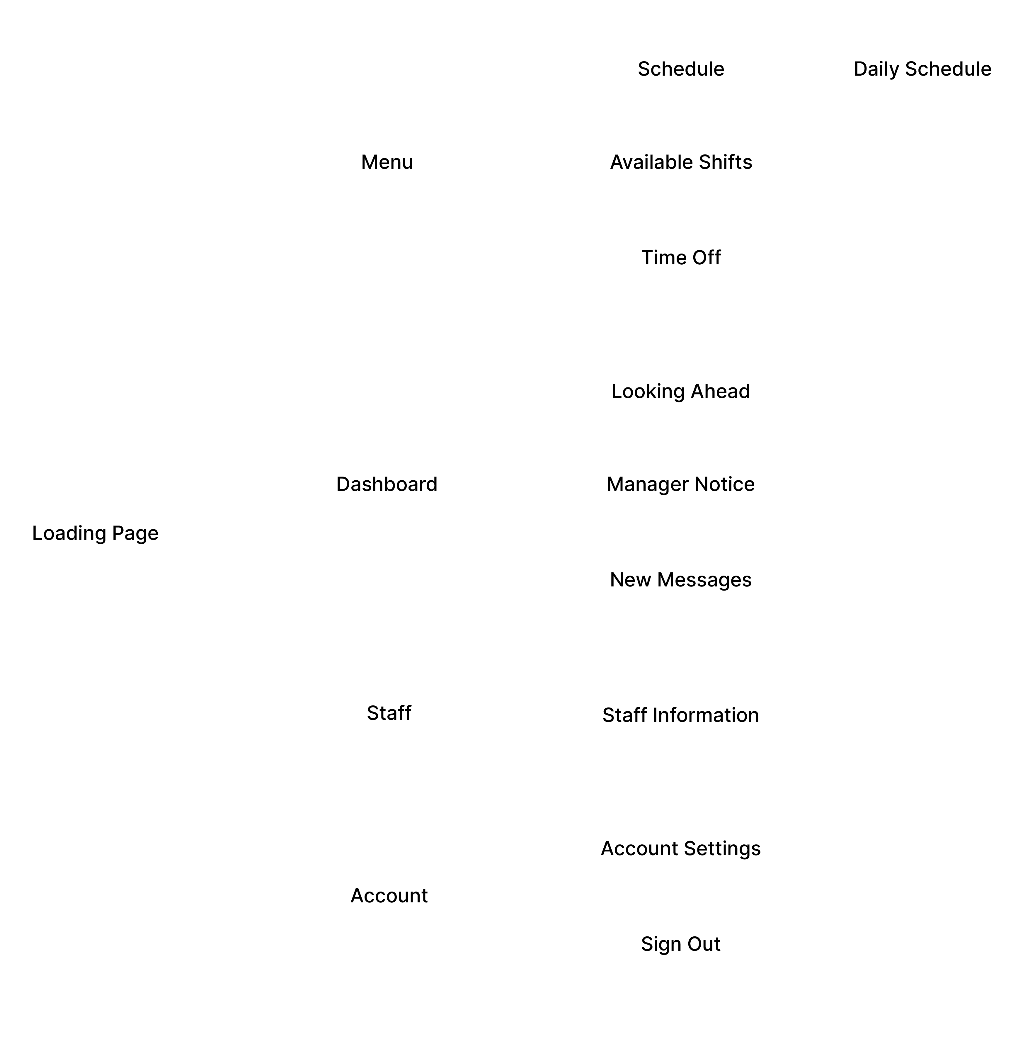
The redesigned app has been reorganized so that there are no longer duplicates of information available to the user. Each page has its own subpages that provide specific tasks relevant to the parent page (ex. staff page includes actions to message and interact with staff), making the application easier to navigate for the user and more intuitive.
Messaging on the app redesign is now done all in a single place. Within the staff page there is a list of employees with their contact info and a message icon that allows the user to send a direct message without having to first search for an employer's contact, making in-app messaging much less complex. New messages continue to appear on the user's dashboard, now with the ability to respond or trash the message without having to navigate to an entirely new page.
Overall, I really enjoyed spending some time analyzing an app that I have had a close relation to over the course of four or so years. I was able to identify the problems that frequently frustrated myself and many other staff members while using the WhenToWork app and use my creativity to develop solutions. I hope to have the opportunity to work on more app redesigns that I am familiar with in the future.
If I were to have more time with this redesign, I would like to develop additional pages like a “Sign in or Create an Account” page and a “Loading” page when the app needs time to process data. If I had the opportunity, I would also like to work with an API or back-end data software to allow the messages in the WhenToWork app to also be sent directly to a user’s personal cell phone number or email.